

beli
a food ranking app
adding a feature to an existing product
Role
UX Research
Tools
Figma
Duration
6 Weeks
UI Design
Prototyping + Testing
Background
Beli is a social foodie app that allows users to rank restaurants all over the world using a specialized algorithm. Users can follow others and see where their friends have dined and what their rank is on the Beli platform. The more restaurants you dine at, the higher your Beli ranking will be, incentivizing users to be more adventurous and try new places. It is also a great app to keep track of memorable dishes, good or bad.
Problem
Beli has a social aspect, but it very limited compared to other social media platforms. Currently, the most followers can do is see where others they are following have eaten and the ranking/notes they have given a restaurant or certain dish. They are also able to like and comment on others’ rankings.
Solution
Users will be able to create a list in the “My List” section on their profiles. SImilar to playlists on Spotify, these lists will be fully customizable (name of list, order of restaurants added, description, etc.) These lists can be used to send recommendations to friends who may be traveling, or for friends/couples creating a collaborative restaurant “bucketlist” of places they want to check out in the future.
Research Goal
The main research goals are —
Identify what Beli is doing well currently in terms of UX/UI
Identify what features users want updated or improved
Discover if the personal list feature will enhance user experience and make the app more appealing
User Interviews & Research
I analyzed the data and conducted interviews with current Beli users to check for any patterns and discovered these common themes:
User Pain Points:
Improving the visuals of the feed — currently has too much white space, feels too monochromatic/boring
Prioritization — some features are unnecessary (i.e. Leaderboard in both navigation bar + on profile)
Repetitive — the process of ranking feels repetitive and needs more visuals/user engagement methods
New Feature Feedback:
Most interviewees responded positively — would use “My Lists” feature for planning trips, giving recommendations for others
Useful for upcoming trips and for grouping previous restaurants by theme or location
Other suggestions — making the feature collaborative among many users, being able to comment/like others’ lists, dropdown/stacked ranks
User Personas
The user personas were crafted after gathering information on and conducting interviews with current users. These personas helped guide the new features to be more functional and social for users.


Information Architecture
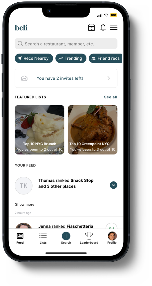
When deciding where to add the “My Lists” feature, I decided that the best locations would be on the “Your Lists” and “Profile” page. The “My Lists” would be part of the header on the “Your Lists” page, located next to the “Been” lists. I wanted to make it an important feature and easily accessible so I placed it before other existing list options such as Want to Try, Trending, and Recs.
On the Profile page, I replaced the “Leaderboard” box with “My Lists"“ since Leaderboard is already part of the navigation bar. This would also allow users to see friends’ lists when clicking on their profiles. Making it bigger than other lists located on the page makes it a standout feature.

User & Task Flows
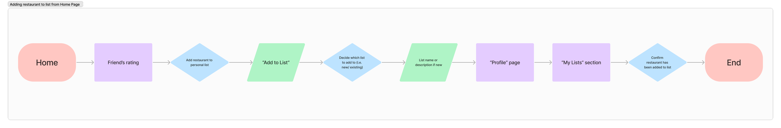
Task Flow #1: Adding restaurant to “My List” from home page
User can see friend’s rating — original app allows users to either bookmark to “Want to Try” or add to “Been” list
This flow will allow users to add restaurant from Home feed to one of user’s personal lists, similar to that of adding a song to a playlist on Spotify

Task Flow #2: Sharing one of “My Lists” with friends
After clicking on a specific curated list, there will be a share icon that allows users to send lists to others through text message
Personal lists can be accessed through “Your Lists” or “Profile” in navigation bar

User Flow #1: Deciding which list to add a restaurant to
User can create limitless number of personal lists, add description, and upload a cover photo
Pick restaurant to add through feed, search bar, or friends’ lists
Lists can be collaborative and multiple users can add to a list for future trips, goals, etc.
Lo-Fi Wireframes


When sketching the low-fidelity wireframes, my primary concern was placing the new feature in places that would feel natural. I knew I wanted to place it in the “Lists” page, where all of the lists already existing on Beli are located. I placed it second behind the “Been” list since Beli’s main purpose is still to keep track of where the user has been. I also placed it on user profiles, replacing the user’s rank with the new “My Lists” feature instead. This way, when the user clicked into others’ profiles, they have a way of viewing others’ public lists.
Additionally, one UI feature I added while sketching was collapsible posts. While some users post after each meal, I found that many liked to “binge rank,” causing this one user to take over entire feeds. This sometimes hinders users from scrolling further down and interacting with other posts since they are pushed down so far. The idea is that posts and bookmarks created within a two-hour period will be collapsible and all of them can be seen by pressing the dropdown arrow.
Mid-Fi Wireframes
Ranks and bookmarks made within a two-hour span by a single user will be collapsible, giving more feed space to other users.


New UI feature showed above and to the right allows user to rank + bookmark multiple places without taking over others’ feed, allowing Beli to be more social.
The “My Lists” feature can be easily found in two places — the “Lists” page and on users’ profiles. The new feature follows the same layout as Beli’s Top X lists.

Users’ personal lists will be found in the same place on every profile and users can click to see others’ public lists. Users can also interact with lists — like, comment, share.
Usability Testing
User testing was conducted over the phone while users shared their screen as they tested the new features added to the Beli app. All users were asked to explore the app, then to complete tasks with as little to no guidance as possible. They then answered questions asking about their experience using the prototype and going through the given tasks.
Participants: Four participants — three users familiar with the app, one new user
Task flows: Getting to “My Lists” feature, creating a new list, adding a restaurant to a list from the Search page
Success metrics: Ability to navigate and complete tasks with little to no assistance, number of user errors made, amount of user frustration, user satisfaction reported
User Feedback:
Visually — less white space than before but lots of unused white space remains, sticky bars are not opaque/ cohesive on some pages
Getting to “My Lists” — easy to locate, more visually engaging than the rest of the app because pictures, creating and sorting lists is simple/self-explanatory
Creating a new list — reminiscent of creating a playlist, buttons can use text next to icon, search feature directly from the list without having to go back to Search page saves time
Adding to personal list from Search page — feels very text-heavy, pop-up having pictures makes it easy to recognize which list to add to
Prototypes + Iterations
Kept the stacked collapsible posts feature from mid-fi wireframes to allow more users to show up on the home feed

Added features to the “My Lists” page such as filtering and sorting lists

User can create new list from “My Lists” page by pressing the (+) icon next to the Sort By option

The cover photo can be edited by user; Icons on top allow user to add collaborators, like, comment, share, and add restaurants to the list

The (+) button in the list allows the creator and collaborators to add restaurants directly to the list without leaving

Another way to access lists is by pressing (+) icon next to restaurant name on Search page — can choose from Been, My Lists, or create a new list to add the restaurant to

Popup when choosing to add to already existing lists — shows cover photos for user recognition and radio buttons to allow users to choose multiple lists

Placing new personal lists feature on profile gives users more to see when pressing on others’ profiles; also lets users interact with friends’ lists
Conclusion
This was my first time adding a feature to an existing product. It was a great learning experience where I was able to take a lot of time to observe the app and recognize both good and bad design features. Until now, I had been creating products from beginning to end, but I realized through this project that I have accumulated enough knowledge to know what can positively or negatively impact the user experience.
For future projects that require adding an existing feature, I would like to be able to do something on a bigger scale if possible such as changing more of the UI. Even for Beli, a lot of the users I interviewed mentioned that there was a lot of white space but I wasn’t able to address this issue as much as I would have liked.
Overall, this project allowed me to reflect on my growth as a UX designer. It would be great to work with other designers in the future to come up with more ideas for new features and improve design systems.