

Twodate
Project Type
Student Project
Background
Twodate is an app that helps create itineraries for future dates. Each person will be able fill out a questionnaire prior to each new date. The app will then notify users 3-4 days prior to the date day with an itinerary to follow based off of the questionnaire responses. The date must be “completed” and both partners will have a chance to reflect and leave notes or photos after the date.
2.
Solution
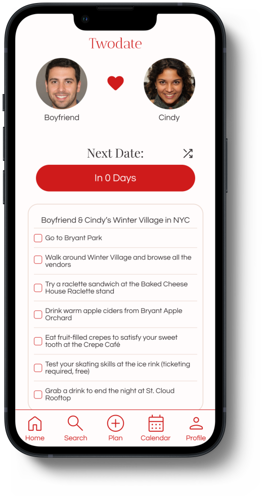
An itinerary as long or as short as you want
Checkbox-style itinerary so you can complete or skip as many parts of the itinerary as you want
A shuffle button for a different itinerary if you don’t like the original
Connecting to your partner for both people to have access to the itinerary

Mandatory questionnaire before the each new date
Having a mandatory questionnaire ensures that both people’s preferences are taken into account
A short and fun questionnaire creates excitement for the user
The questionnaire covers various types of dates including virtual, indoors, and overnight trips
RESEARCH
Problem
1.
User Interview
Research Goals
Understanding date planning obstacles couples may face
Identifying target users and their needs — understanding what would make the app fun, reliable, and usable long-term
Exploring relationship/date trends — how often do couples go on dates currently, what are their favorite/least favorite things to do, what are some obstacles when planning
Competitive Analysis


Most people defined “date” as including a dinner + activity that takes place outside the home
Factors that most affected the frequency of dates were distance (in-person vs. long distance) and length of relationship
Common factors affecting date quality were location, price, weather, and schedule coordination
Many seemed to not enjoy the planning process but felt forced to take charge because their partner was less involved/opinionated
IDEATE
Choosing core focuses for the app.
At this point, I gathered my research and thought about the key problems i was trying to solve. I had to consider what was and wasn’t working in other successful apps, and how Twodate could address these issues. I also tried to consider all of the frustrations users had mentioned in the interview, and how exactly Twodate would ease the planning process.
I focused my efforts on clarifying who and how users would use and benefit from the app. I began my research by asking 6 participants, all in relationships of various lenghths, what their experience with dating and planning was like. I synthesized the collected data from these interviews into an affinity map to help inform insights and brainstorm solutions.
Creating the flow of key features.
There were three main tasks to outline:
Signing up
Planning next date
Completing a date - uploading date recap
For these user flows, I thought about the specific steps the user would have to take to complete each task.

User Flows
DESIGN
Wireframes


Removed text in navigation bar for more space and added indicators (fill) for users to know what page they were on

Duration
6 weeks
Recognizing patterns in my user interviews.
Tools
Figma, FigJam


Brand Guide


USER TESTING

Increased line height throughout the app for improved readability
Changed heading text from Antic Didione to Playfair Display and added text weight for improved readability


Iterations


Changed from bullet point to checkbox style to make itinerary feel more interactive and optional
Added shuffle button to allow users to change itinerary and have alternative options
Improved questionnaire for couples by adding more questions — schedule + transportation method availiability
I carried out 6 moderated user tests with the same participants I interviewed at the beginning of the project. Based on user feedback, I made a few improvements.
Participants: 6 participants in their 20’s, all currently in relationships
Task flows: Signing up, completing a date, uploading a date, filling out questionnaire, accessing profile/account settings
Success metrics: Ability to complete tasks with little to no guidance, number of user errors, user frustration, user satisfaction, overall feedback

How might we cater to all the different types of couples using the app?
Various obstacles
Couples may struggle to “date” or plan activities together if there are obstacles in the way, such as distance
Role
New, creative ideas
Couples that have been dating/married for a long time find it difficult to come up with creative/new dates each time
Sole UI/UX Designer
Scope
End-to-end mobile app application
What questions should be included in the questionnaire to generate optimal date itineraries for users?
This project allowed me to be extremely creative, working from end-to-end on a mobile app for the first time. The ideating process took longer than usual because I didn’t want to create an app that felt overused or cliché.
The researching process allowed me to realize the different types of date apps out there, and the importance of UX and UI when comparing badly made apps to good ones. Additionally, I dove in deeper to really address as many different types of “dates” and “dating” as possible and kept an eye out for diversity + accessibility.
For future projects, I would like to be more creative with my UI. This time around, I focused more on adding prime features and having it feel romantic and modern. However, the app could have been improved if I were able to add more graphics or animation to interact with users throughout the date receiving + questionnaire process.