

BACKGROUND
Lê Phin is a small, Vietnamese café located in New York. Their menu is unique and incorporates flavors of Southeast Asia with drinks like the pandan matcha latte or Vietnamese iced coffee. There is a small space for customers to sit down and do work or take a moment to slow down and people watch through their window.
PROBLEM
The café did not have a website for their business and the owner, Kim Lê, relied solely on social media and foot traffic for customers. She wanted to reach a wider audience by having an online presence and offering different ways to order (to-go, delivery).
How might we tell Lê Phin’s story in an interesting way and encourage users to order?
SOLUTION
A simplistic website.
Creating an easy-to-navigate website so there is no way to get lost. Users will be able to learn about the café, browse the menu, and place an order.
RESEARCH
COMPETITIVE ANALYSIS
I started my research by identifying 3 other specialty cafés in the area. These cafés, like Lê Phin, had niches that made them stand out from coffee chains or simple grab-and-go coffee shops. I identified key trends of these cafés and opportunities where Lê Phin’s website could stand out.

SURVEYS
USER RESEARCH QUESTIONS
What information does a good food business website contain? What kind of information are you looking for most?
How important to you is a food business’ online presence when it comes to determining credibility?
How often do you visit websites before going in for the first time?
58%
of participants say online presence is important prior to visiting for the first time
IDEATE
USER PERSONAS
From gathering my research findings and speaking with Kim, I was able to create user personas for me to reference for the remainder of the project. The target groups consist of New York locals in the area and younger tourists who look into newer, trendier spots. They helped me focus on the user’s needs and not let my own judgements influence design decisions.

INFORMATION ARCHITECTURE

DESIGN
The sitemap for Lê Phin is very standard for a food business. The landing page to be as functional as possible by providing necessary information (i.e. hours, location, access to menu) in a single scroll. The “About” page was made per Kim’s request because she wants to showcase how Lê Phin is unique and the story of how the café came to be.
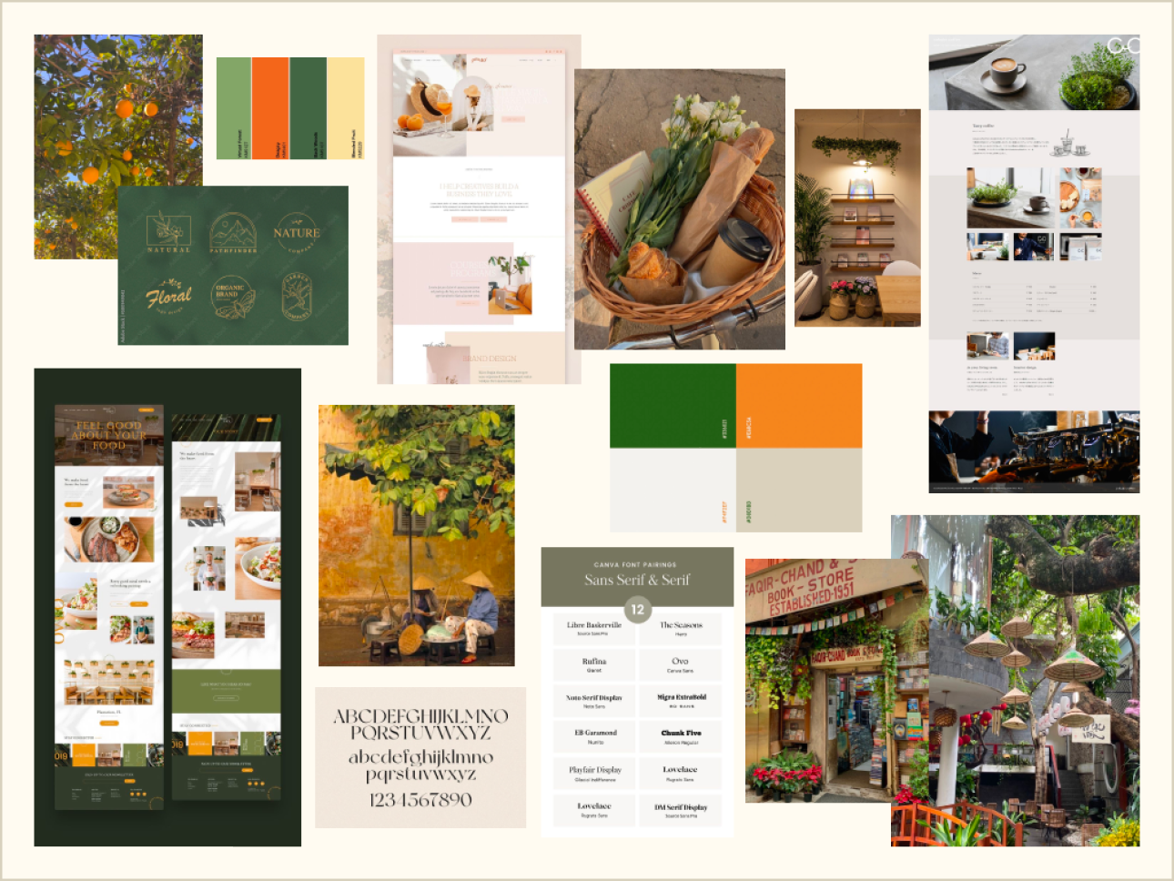
STYLE GUIDE
Creating the Southeast Asian brand.


TESTING
Throughout the creative process, I continued to discuss Lê Phin’s needs with Kim, the owner. The original primary color started off being different shades of orange with secondary colors being various shades of green. Later, while creating high-fidelity wireframes, I realized that green was a better fit. Lê Phin had lots of green influences that better aligned with the branding, such as their pandan matcha latte and matcha pastries.
WIREFRAMES
USABILITY TESTING
Participants: 10 participants who have been to cafés and used food business websites, all in their 20’s
Task Flows: Browsing the menu, placing an order for an iced pandan matcha latte with oat milk, completing checking out
Success Metrics: Ability to navigate + complete tasks without assistance, little to no user errors + frustration, user satisfaction + feedback, increase in revenue due to online sales + increased foot traffic, wider audience
User Testing:
ITERATIONS
Placing orders – connecting the website to an ordering platform (Doordash) and making this experience as seamless as possible
User tests conducted over the phone, where users were asked for permission for their screen to be shared and the conversation to be transcribed as they utilized the prototype. All users were asked to explore the website, then to complete user tasks with as little to no guidance as possible. They were then asked questions to gather their feedback and experience using Lê Phin web prototype.
2.
Placing online orders.
REFLECTION
If I had more time for this project, I would do some things differently. There were instances when there was lack of communication or responses from the business owner because they were busy. For future projects, I plan to schedule meeting days/times prior to starting the project so that both parties (the designer + stakeholder) manage time better and stay on track for the finish date. I would have also liked to gather more customers from the actual cafê as well to get a better understanding of areas Lê Phin specifically can improve upon, rather than cafés and food business websites in general.
Some next steps:
Tracking website traffic and online orders, as well as comparing sales before/after the website to see if the website was successful in attracting more customers.
75%
of participants would be enticed to visit a new location if the website offers menus, prices, and images
67%
of participants mentioned taste + service consistency as factors that motivate them to return

Adding left + right arrows in the "Gallery” section of the “About” page for future additional images
Adding more buttons for navigation throughout the website - “X” buttons, back buttons
Having quantity # appear on cart icon in the header after item(s) have been added
Dietary restrictions — a notes section to enter allergies, gluten-free, vegan, etc. for options not listed on menu
CONCLUSION
User Feedback:
Iterations include:
Making the image sizes more proportional to the other elements on the screen
Adding more buttons for user navigation throughout the website — back, cancel
Increasing line height and spacing for better readability and clickability
Having order quantity appear over cart icon upon adding items for user confirmation
Creating a sticky header on the “Order” so users can navigate between different menu sections quickly